
Background
The idea of applying a notation to reporting has been made popular by Hichert. Meanwhile this work has been handed over to International Business Communication Standards or IBCS. There are several specific tools available to produce IBCS-conformant charts and tables such as Hi-Charts. Although these are very fine products for their purpose they strongly adhere to the IBCS standard and at least currently are
- only available on Windows and Microsoft Office (no Mac, no iOS)
- only adjustable in limited ways such as colors and font size, but not the layout of the charts or even the font itself
In my workplace I needed a solution which is available on more platforms, namely Windows, Mac and iOS. Following this requirement was the ability to adjust certain design elements such as fonts to work consistently across these platforms.
This post is my personal attempt for implementation with the aim to make it work on various platforms (Windows, Mac, iOS) and to allow team members with a lower affinity towards presentation and reporting a lower barrier of entry. The solution is based on Microsoft Office which is available on the required platforms and especially on iOS has made huge progress since the CEO Satya Nadella took over.
But why should someone introduce a reporting notation anyway?
Introduction
Professionals in music, geography and engineering have long used notational standards to exchange and share their work. In business communication, however, there are often not even standards established or applied.
The International Standardisation Organisation (ISO) defines the benefits of standards as follows:
Assuming that well informed managers make better decisions, business communication should strive for transparency. Transparency means that correct, full and understandable information at the right time from reliable sources are provided. The introduction of notation standards increases transparency in two ways: comprehensibility and credibility:
Comprehensibility
Notation standards enhance comprehensibility of reports and presentations by introducing rules for their conceptual and visual design. Reports are easier to understand, if
- they convey a clear message
- they are clearly structured
- objects meaning the same also look the same
- high information density better reveals relationships
Credibility
The application of notation standards increases credibility of reports and presentations. Decisions are easier made when trusted that no information is missing or presented in a misleading way.
Other benefits
Next to contributions to transparency the introduction of notation standards has further benefits. The following matrix shows the process of decision support in columns while the rows detail the expected benefits.
| Data Delivery & Systems | Analysis & Message | Evaluation & Decision | |
| Quality | 1 | 2 | 3 |
| Speed | 4 | 5 | 6 |
| Cost | 7 | 8 | 9 |
Data delivery and systems
This phase deals not only with the delivery of correct, timely and relevant data but also with provisioning of suitable systems for analysis and reporting.
Analysis and message
During this phase data is analysed with the target of gaining a clear view on the business situation. . Result of this stage are reports and presentations.
Evaluation and decision
In this final phase managers make decisions based on their evaluation of the message conveyed in said reports and presentations.
In these individual stages three main benefits are to be gained when introducing a notation standard in business communication:
1. Better quality
The quality of results in all three phases is going to increase. This stems from easier to understand reports and presentations and will ultimately lead to better decisions.
2. Shorter reaction time
The duration of the decision process will shorten. Thanks to templates reports will be produced and the messages to convey will be derived more quickly.
3. Reduced costs
The amount of time to compile information, analyse data and produce reports and presentations will reduce significantly and thereby reduce associated costs. The biggest advantage though will be the time saved by managers as they will be enabled to understand reports and presentations more quickly.
Objectives
This aims to define standards for the notation of a virtual reporting process in order to gain above stated benefits for internal and external participants in decision making an various platforms.
- Create a visual language that synthesizes classic principles of good design aligned with standard tools already employed in a lot of companies in the reporting process thus avoiding additional cost and complexity
- Develop a single underlying system that allows for a unified experience across end products
- Forgo additional complexity by avoiding introduction of special software or even fonts
Principles
Minimalism
Minimalism aims for simplicity and objectivity. Its aim is to reduce to the fundamental, the essential and to strip away the ornamental layers . The content has priority, everything else has to support the message. The aim is to achieve „more with less“. This is anything but simple to achieve as there is no hiding behind decoration. It also means the existing elements grids, typography, space, imagery and color need to be applied more skillfully than ever.
They create hierarchy, meaning, and focus. Deliberate color choices, edge-to-edge imagery, appropriate typography and intentional white space create an interface that immerse the user in the experience and provides waypoints for the user.
Respect
Successful communication is depending on awareness of the audience. Reporting as part of communication also has to be tailored to the recipients. The notation described in this document is one element to avoid potential misconceptions and reduce friction in communication.
Notation
Notation is used to communicate faster in a clear way. Notation **standards** describe commonly used ways how to describe certain things, i.e. how to report.
In this context notation standards for value and volume numbers in business communication could be seen as a systematic approach for data visualization or Information Design.
Notation of meaning
The same content should be visualized the same way. Reversely, what looks the same should also mean the same. This aspect comprises the meaning of terms (words, abbreviations and numbers), measures, scenarios, timelines and structures as well as comparisons and variances.
Items with this meaning should be notated in a unified way in order to make the content as easy to understand.
Design of components
Design in this context means layout, structure and display of all components. Components comprise
- Communication products (reports, presentations, statistics)
- Pages
- Objects (charts and tables)
- Object elements (axis, title, columns)
- General elements
- Titles
- Messages
- Footnotes
Generally a page consists of elements and objects. All of these should be subject to a notation standard in order to maximise comprehensibility.
Simplified Reporting Notation Standard
Colours and Typeface
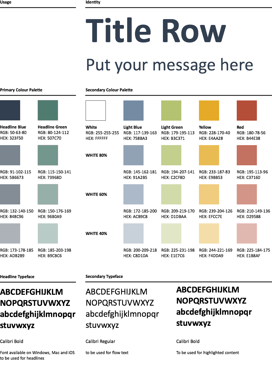
The colors are just meant as an example. They are bold enough and carry sufficient contrast to be distinguished also on older projectors. The font Calibri was chosen as it is pre-installed on Windows and Mac machines and is available in MS Office on iOS. It looks relatively contemporary and avoids the hassle of installing separate typefaces on various computers.
Data Types
In business reporting most of the dimensions for comparison will be Actual, Budget, Forecast and Last Year. The notation is visualised below:
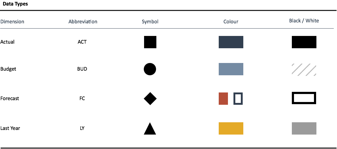
One exception to the rule is Forecast, which should mostly be notated as shown in the B/W column with the respective colour. Only when Forecast dimension is to be shown in parallel to Actual should the “Colour” column be applied. If you are interested in the source Sketch files, you can download them here.
Application
This section provides examples based on the concept described above
Charts
A presentation slide containing message and chart is visualised below:
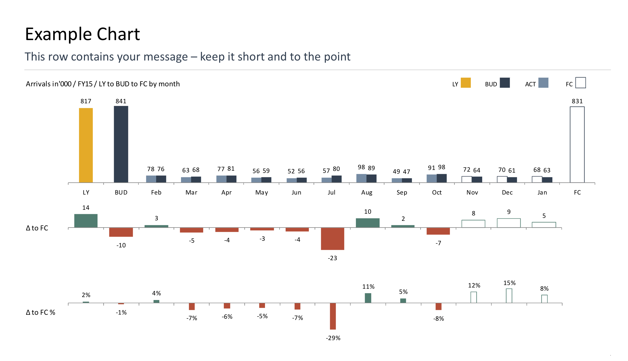
The slide makes use of the notation by
- putting the message to the top left where the attention level is the highest
- applying coded colours for the chart for each data type
- leading the reader in time from left to right
- increasing information density by adding absolute and relative variances
- avoiding noise and unnecessary clutter
Difference to the outlined IBCS standard is a separate bar for each dimension instead of overlays. I prefer this as it avoids overlaying values on top or next to the bar charts. Plus it does not require sophisticated Excel skills to put this together. If you are interested, the download link is here.
Tables
Tables should include graphical elements to visualise variances and clearly highlight data types. An example for monthly and cumulative comparisons to budget looks as follows:
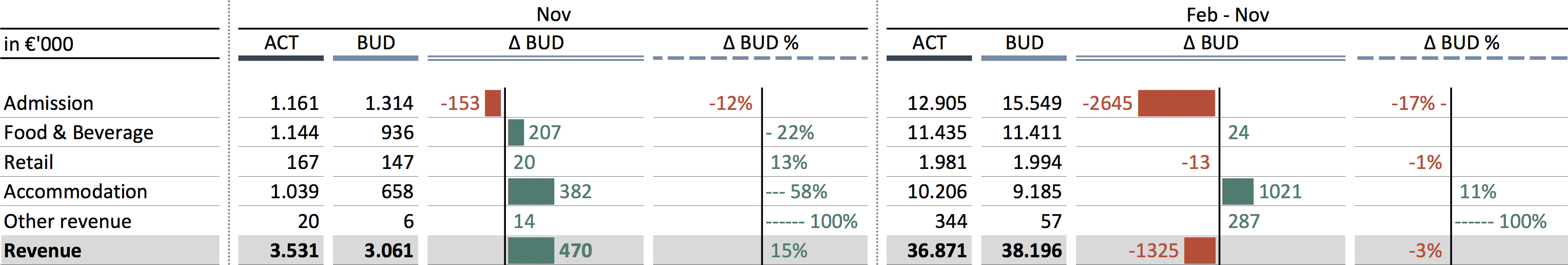
As stated above, this is very much based on existing work, but to me feels less fidly by using more of the basic MS Excel functionality. The source Excel file can be downloaded here.
Conclusion
In my opinion this to be a more practical approach if the requirement is to
- support multiple platforms
- take into consideration that the average office worker is not necessarily able to make changes to standardized software packages rendering the charts
- to be able to adapt layout and design on your own
Please tell me what you think in the comments.
https://youtu.be/H8AT_skSiiA
Excel reporting tool is also available for Mac